It seems like I posted on this ages ago but the new user experience for the Google Play Store for Android appears to be rolling out to the masses at this point. Over the course of the past 24 hours or so, multiple people have posted screenshots of their devices sporting the new look store on Google+, Facebook and even a few dropped them in email. If you are still waiting for the update to come to your devices, your wait may not be much longer. As for me, I received the updates about 5PM MST today on both my Nexus 6 and Nexus 7 at the same time (seems once one updates they all update on your account).
To be clear, there is nothing you can do to push this update to your devices. Yes there was an update to the Google Play Store app a couple of weeks ago but this UI change is server side. You have to wait until you get it.
So What’s The Big Change in The Google Play Store?
Mainly this change is all about the look and feel of the store. Instead of having block style banners at the top of the page, you have a page with a banner at the top advertising games and other
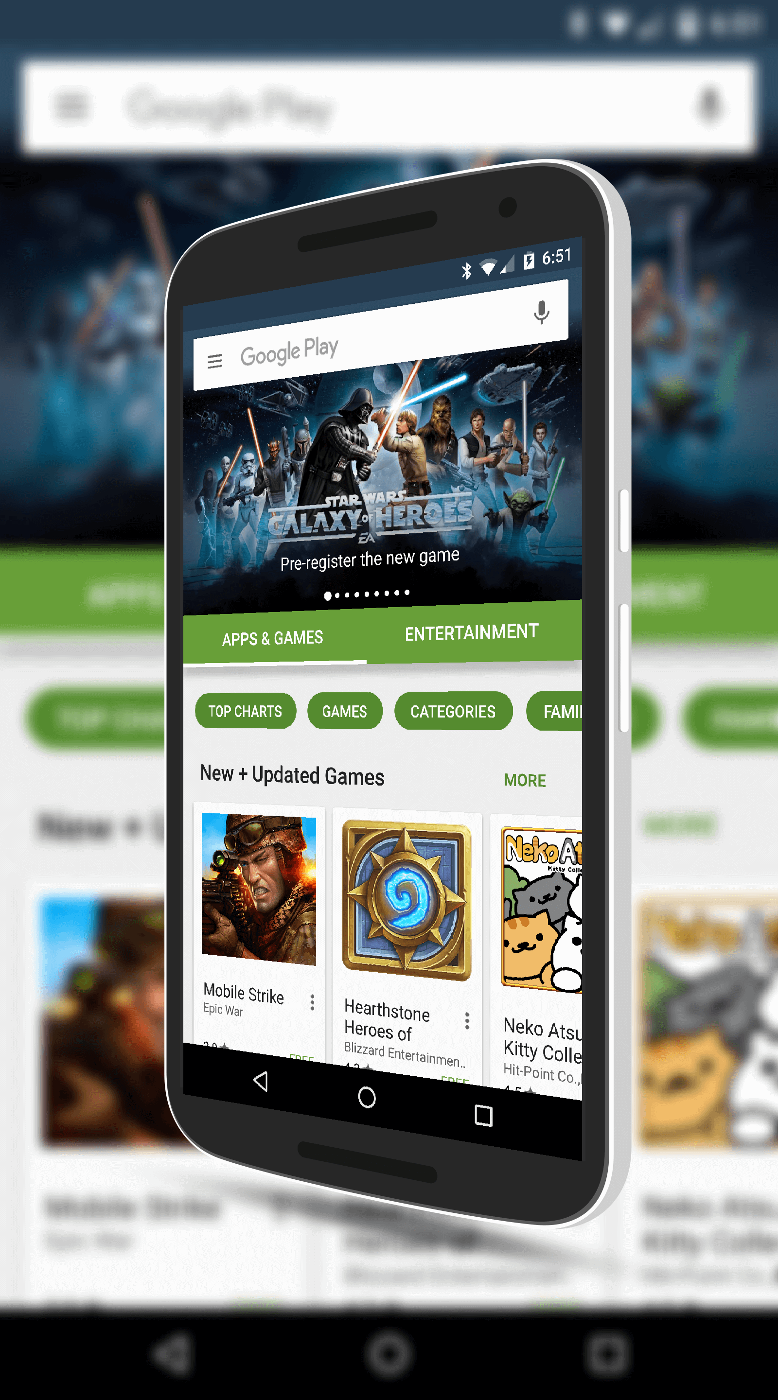
New Google Play Store for Android
content with a two-tab menu below it: Apps & Games or Entertainment. With Apps & Games you see a row of buttons that allow you to look at things like Top Charts, Games and Categories with the lists of app below that you scroll through. On the Entertainment tab you have a similar layout but with buttons to take you to Movies & TV, Music, Books and Newsstand to name a few.
Ultimately the content of the Google Play Store hasn’t changed. It’s the way that the apps and content are presented to you on your Android devices. Likewise, these kinds of changes are more-or-less a beauty in the eye of the beholder situation. Some will like the change, others won’t but frankly it is just an evolutionary step in the life of the Google Play Store.
👍