The experimenting with the layout of the Google Play Store continues as Google trots out yet another new look & feel for the app. The latest update brings a new top level sliding navigation to reach different parts of the Play Store as well as a slightly condensed menu.
The top navigation, in my opinion, is quite nice. All of the major areas of the store are now in a sliding navigation bar at the top of the screen, which makes finding specific areas of the store much easier. This new navigation bar can be slid left to right and then you tap on the area you want to see. Those areas include For You, Top Charts, Categories, Editors’ Choice, Early Access, and Family.
Previously, to get to these areas, you either had to find it on the menu (depending on which flavor of the store you had on your phone or tablet) or you had to scroll down to that section on the main page. Neither was a great user experience and this new navigation bar greatly simplifies the process.
There is also a minor change to the menu in the Google Play Store app with this update. The top item in the menu is now “My apps & games” and it is now down a
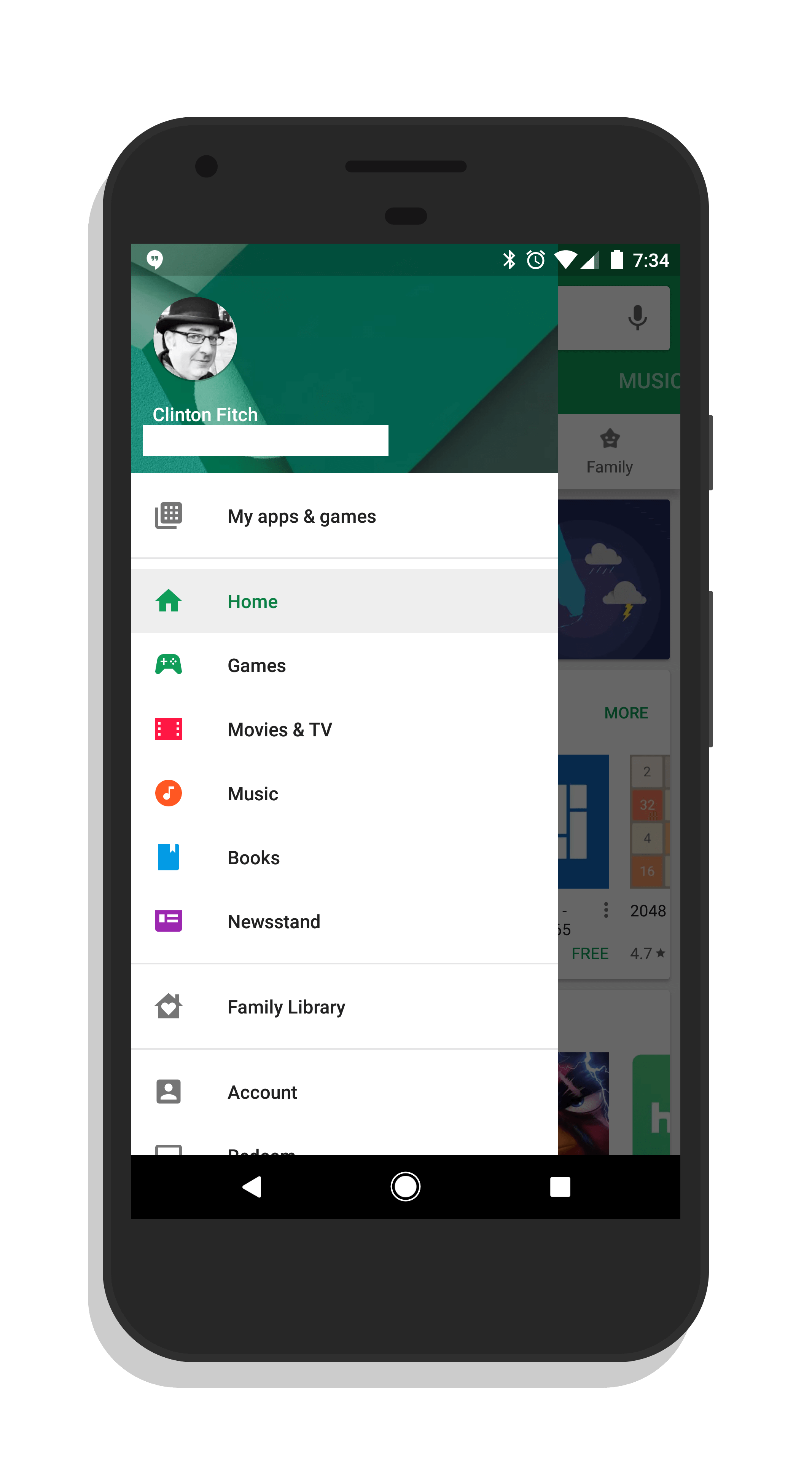
Google Play Store Menu
sub-level from Home. Also, the various major sections of the Play Store like Games, Movies & TV, Music, Books, and Newsstand are now higher up in the menu list and easier to navigate to from the previous layout.
As with other updates to the Play Store, this is something that rolls out on the backend from Google so there isn’t much for you to do. Assuming that you have the latest versions of the Play Store app and Google Play Services installed on your phone (which should auto-update anyway) then it is just a matter of when it gets to your account and devices.