Google has released an update to the Google+ app for Android. The new update, version 10.1.0.187555767 for those keeping score at home and who like to play version numbering BINGO! brings mostly minor cosmetic changes to the social and community network app.
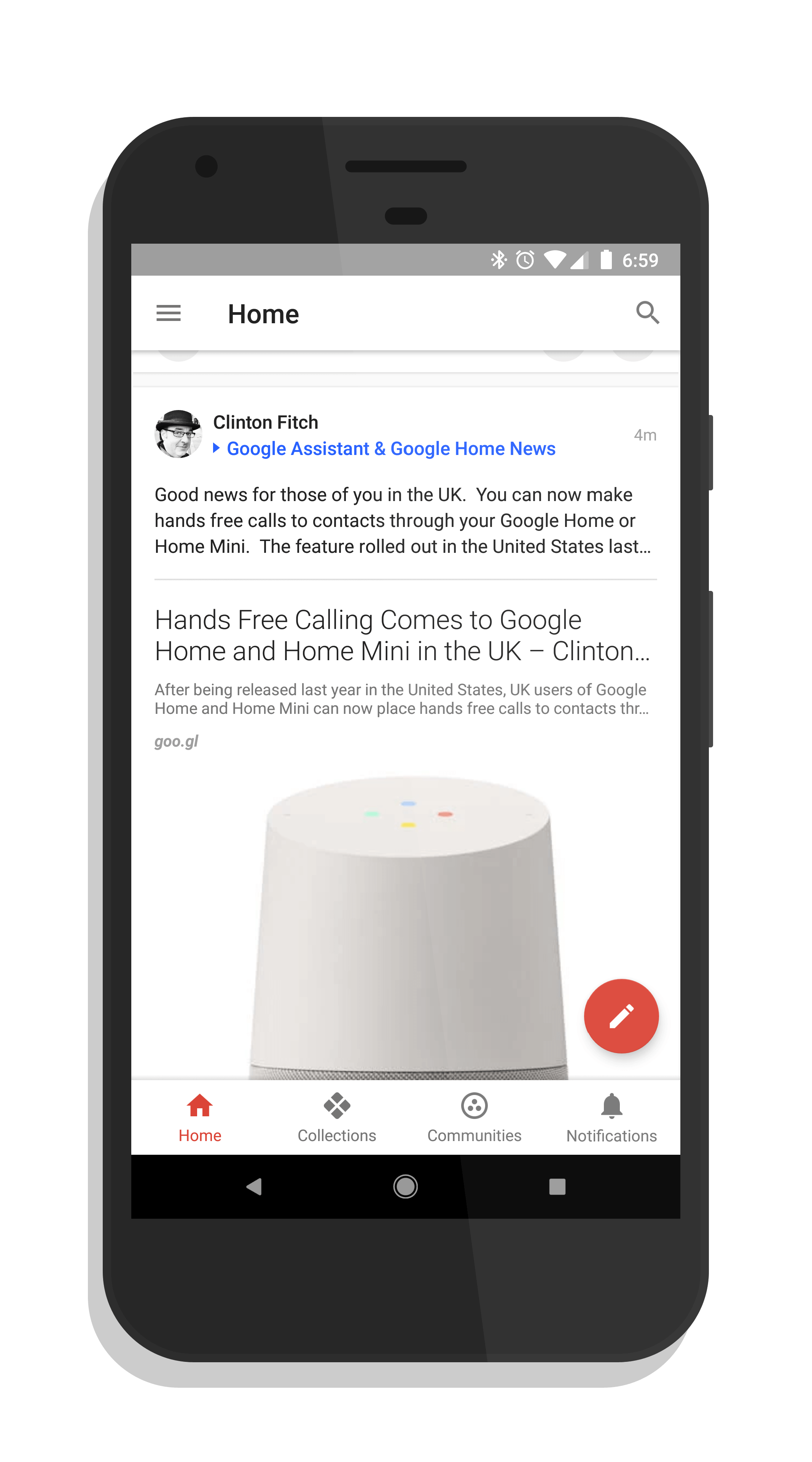
The most noticeable change when you get the update will be the bottom navigation bar. That bar had a dark theme to it in previous versions but now sports a light background. Essentially it makes the UI of Google+ much more white.
When you tap on a particular item in menu bar, the highlighted item changes color and, for Collections and Communities, the UI changes to that color. So on Home the icon turns red, for Collections, it turns blue and the upper part of the UI changes blue too. This isn’t something new but coordinating it with the icons is a nice touch.
Google+ White Navigation
There are a few other typographical fixes and a few bug fixes in this update but nothing major to be honest. All of this is part of an ongoing effort to continually improve the app, which has been undergoing a major rewrite behind the scenes this year.
If you have the app installed, you should get the OTA update for it over the course of the next few days.