Over the course of the past few months, Google has been rolling out a new bright & white look to many of their apps and services. Gmail and Google Drive are two such examples and it all seems to be tied to the Mountain View company’s efforts to refresh everything and bring more Material Design into their sites and apps. The latest site to get this new bright & white update is the Google Support site.
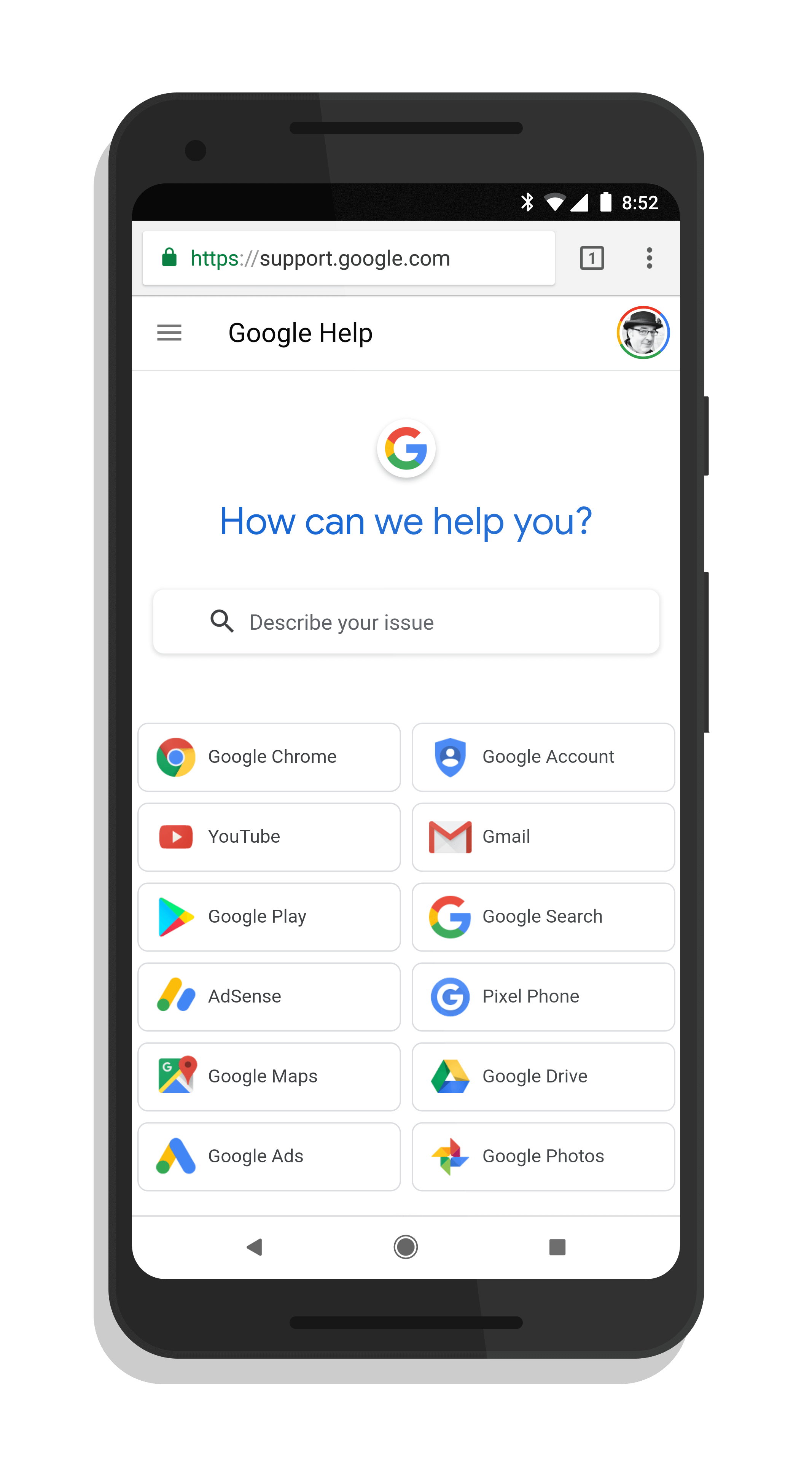
Ditching its compact now seemingly dated look, the Google Support site reflects the change in site layout and philosophy from Google. With a bright white background, the new site has large icons for you to select to get to support information for various Google apps and services. These naturally look more touch friendly for touchscreen devices like the Google Pixelbook.
As with the previous iteration of the site, there is still a large search box at the top of the screen for you to search for help topics. This is true no matter if you visit the site from your desktop or your phone.
Google Support Site – July 2018
Google has made it clear that they intend to revamp everything to this new bright & white style as they continue to push Material Design 2 out to their services. If you like the look, this is good news for you. If not, well, it may be time to embrace the horror.