The Google Payments Center is likely one of the few Google sites that you rarely visit. It is a central location where you can see all of your payment information such as your recent purchases, your credit cards and shipping addresses, and your subscriptions that you have through Google. It is a site that, to be fair, you rarely need to use as most of the information in it can be found in the Play Store app or in Google Pay.
That doesn’t mean that Google doesn’t think it is important and over the weekend gave it a heavy Material Design makeover. The update was a cloud-side push as these things tend to go so there is nothing you need to do on your end. Just go to https://pay.google.com and you will be dropped into the new & improved Google Payment Center site.
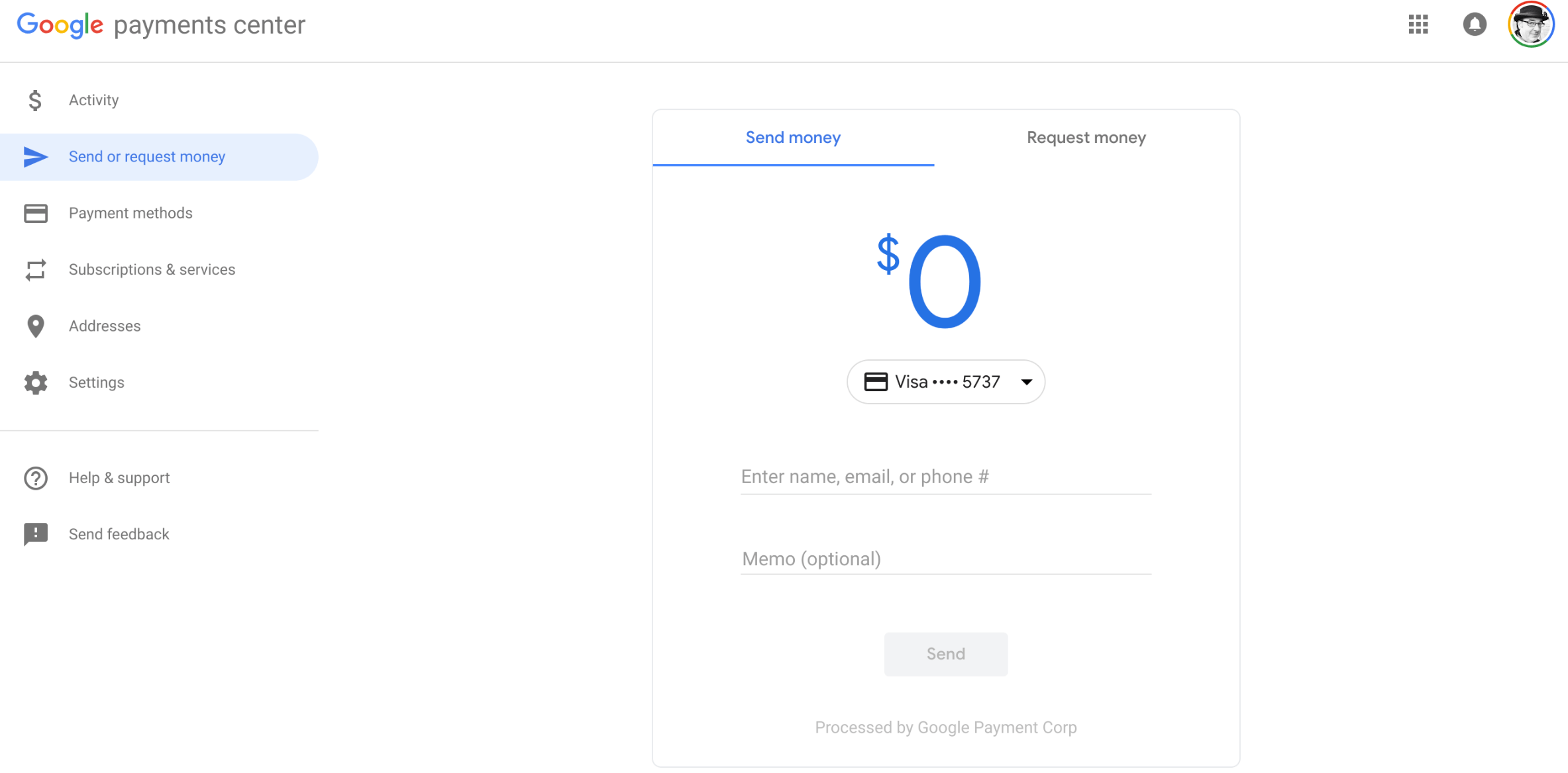
All the things that you would expect to be there are in the site as outlined above along with the ability to send or receive funds to/from other via a mobile number or email address. Functionally, its the same as it was before, just a nicer look.
Google Payments Center Material Design
Google has been going through a significant amount of efforts over the past several months in revamping their apps and sites with Material Design. This is likely to continue over the course of the next several weeks as the Mountain View company seems to be driving the Material Design revamps of apps & sites to the launch of Android P, the next version of Android. That version is expected to be available in the August-September time frame and has a heavy emphasis on Material Design throughout.
No Responses